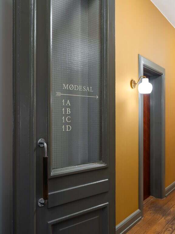
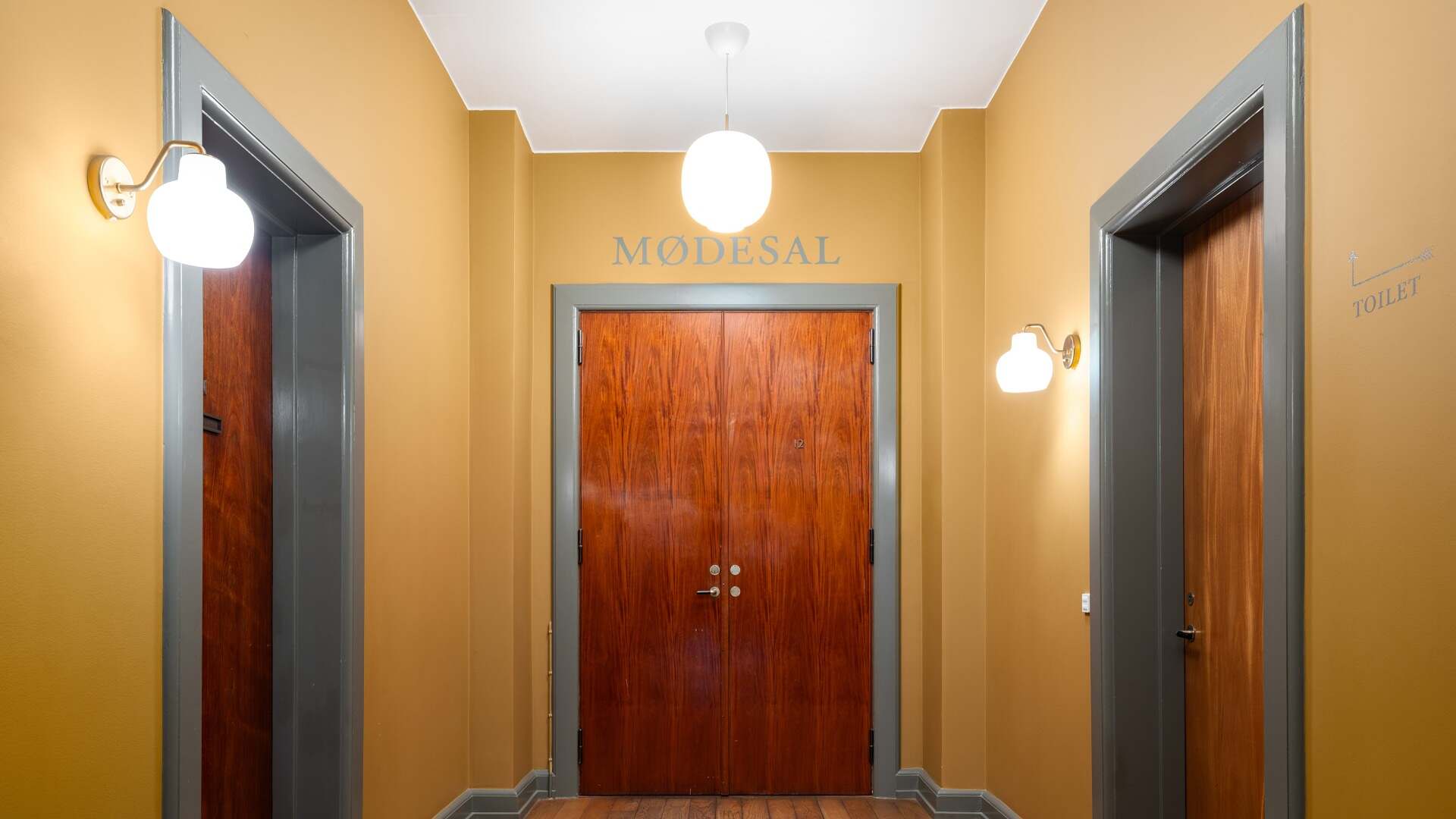
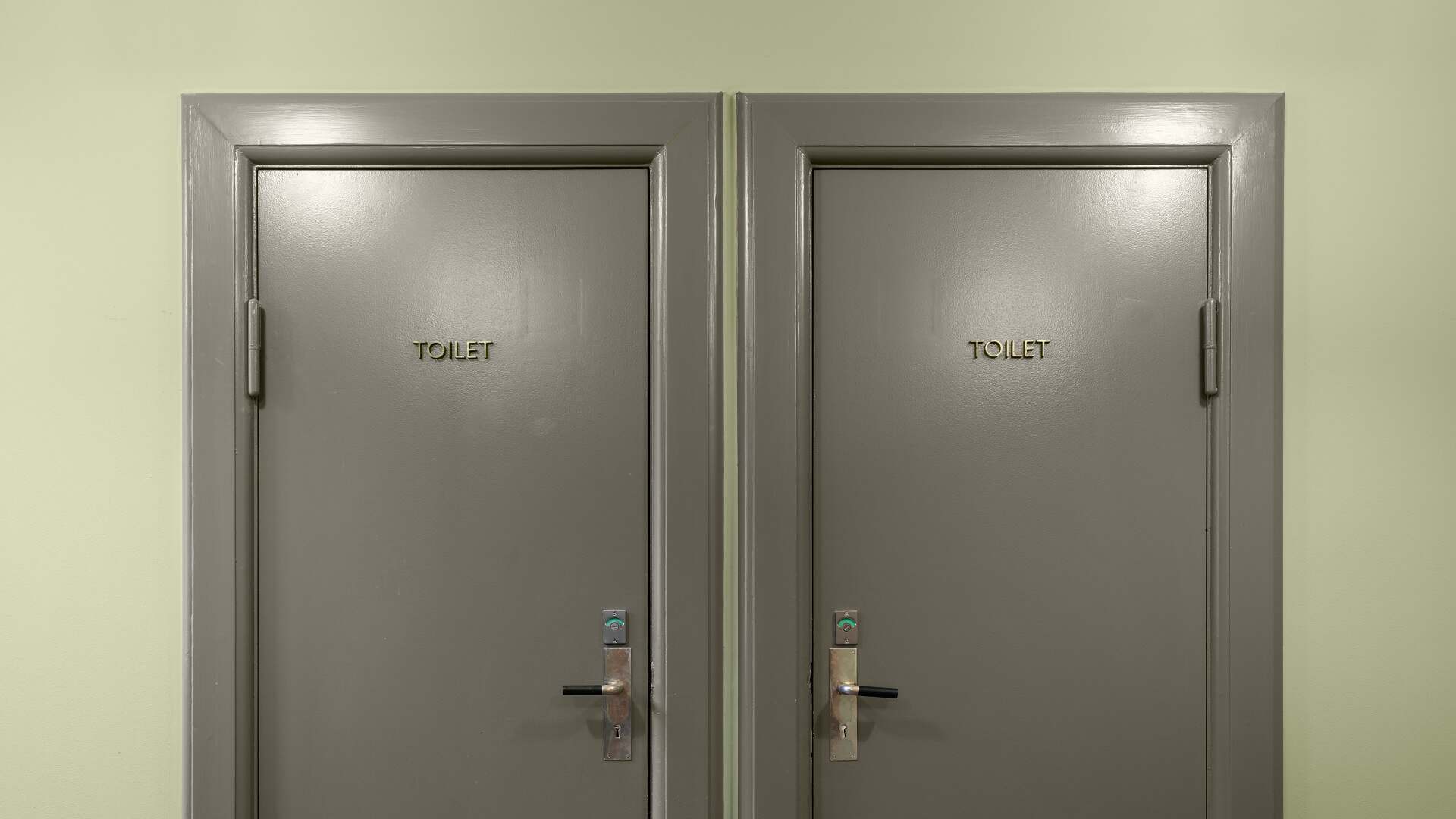
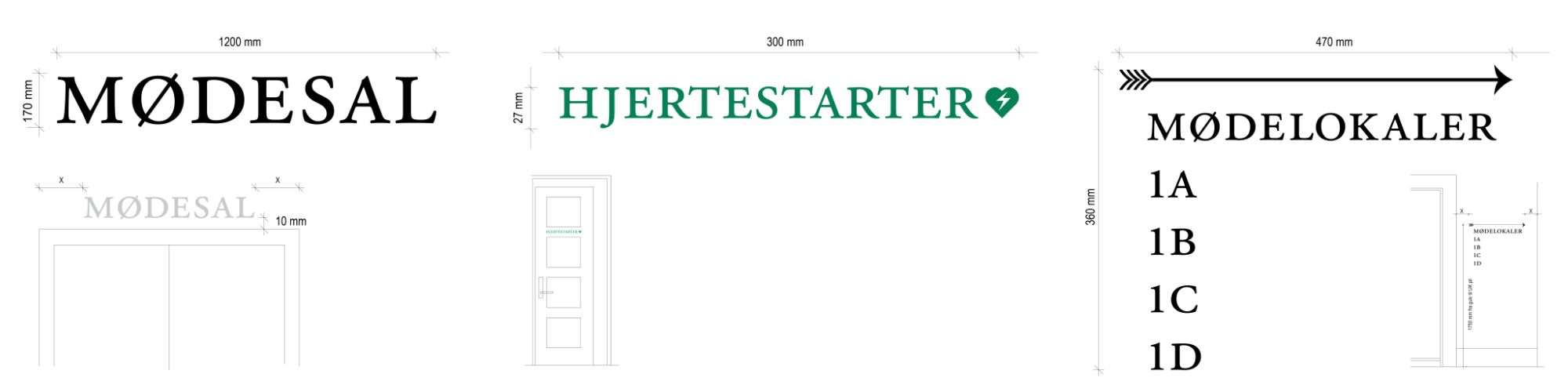
In the historic Customs Building in Toldbodgade, By & Havn has renovated their beautiful premises with respect for the building's architecture and atmosphere. In this connection, KHR Architecture has developed a sign design that supports the building's identity and time period. The solution is based on a discreet and simple approach where the signage adapts to the architecture rather than dominating it. Based on existing typography and materials, a unified whole has been created where wayfinding, aesthetics and cultural heritage merge into a natural extension of the building.
Copenhagen
Denmark
City & Harbour
2025
Wayfinding/ signage
Combined signage and shielding
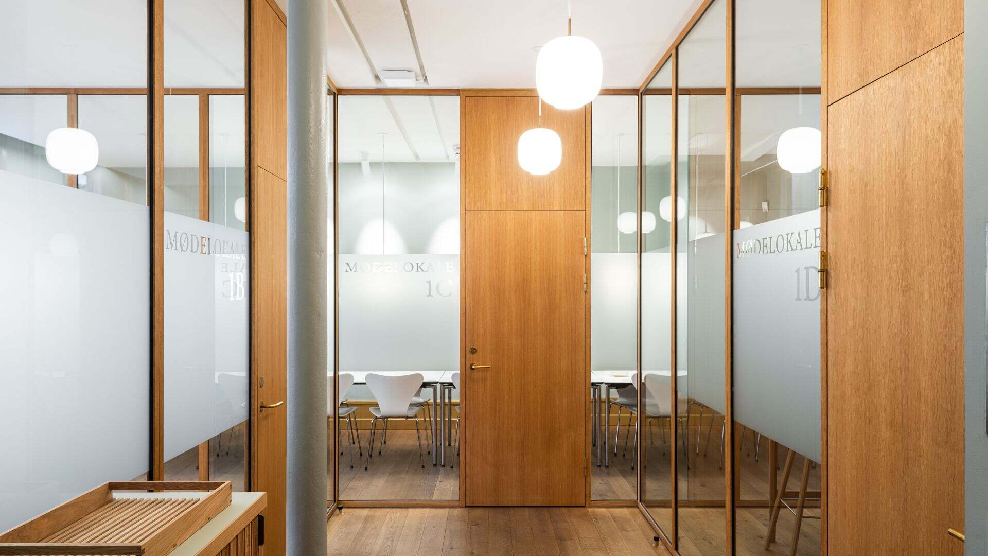
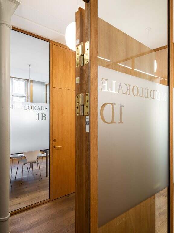
On glass partitions, information and matting are integrated directly onto the surface to maintain transparency and lightness while giving the rooms a clear identity. The tactile expression of the matting supports the graphic line and at the same time provides a discreet degree of privacy in the meeting rooms. The solution balances openness and confidentiality and forms a natural, functional layer in the overall architecture.
“We wanted the signage to feel natural in the building - as if it had always been there. Our task was to create a solution that both respects the character of the building and works clearly and intuitively in everyday life.”
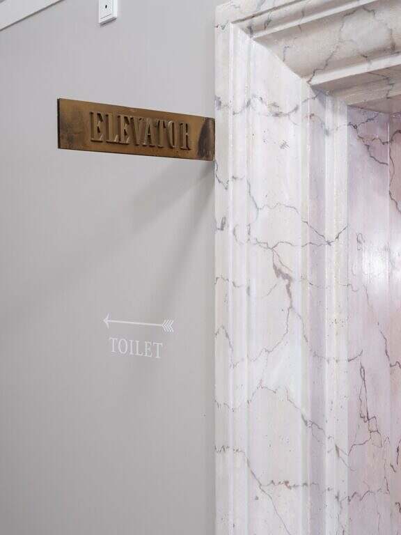
Typography for the site
The sign design is based on two existing fonts in the building: Garamond and Bodoni. Garamond is found on the prominent sign by the main staircase, while Bodoni appears in the reception area and in the door numbering on the ground floor. By continuing these typographies, a visual continuity has been created where new and old are naturally linked.
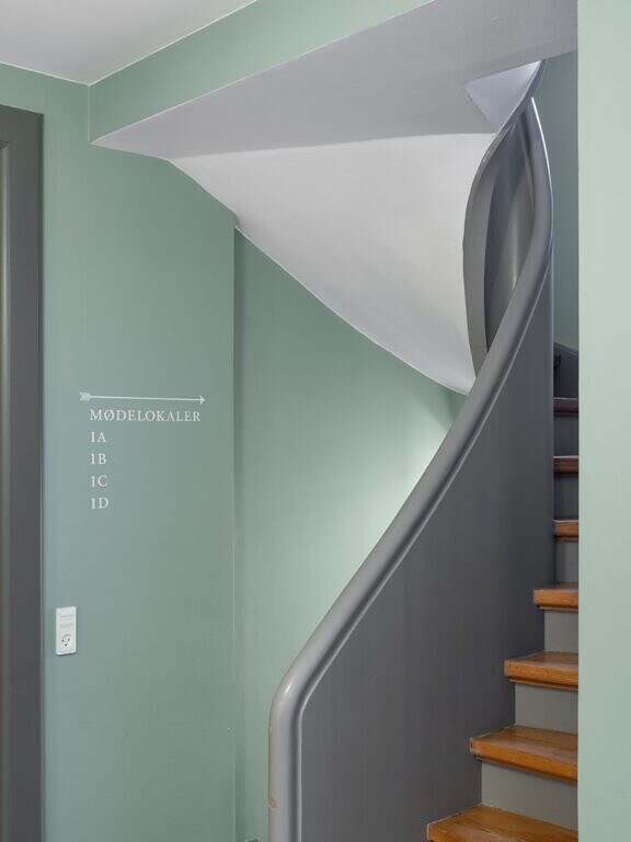
Signage directly on doors and walls
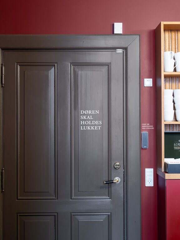
A central part of the solution is signage painted directly on walls and doors - a method historically linked to the building type and its period. The direct application gives a calm and integrated expression where the information appears as a natural part of the architecture. At the same time, the method is both flexible and economical in a building with a strong self-identity.
Discreet signposting
The building has a rich colour palette that reflects its history and architectural layers. In the colour-saturated universe, the signage is made with light lettering that stands out clearly without dominating the spaces. The contrast ensures good readability and orientation, while the expression remains calm and balanced. In this way, the signage becomes a precise but discreet element in a building with strong character.
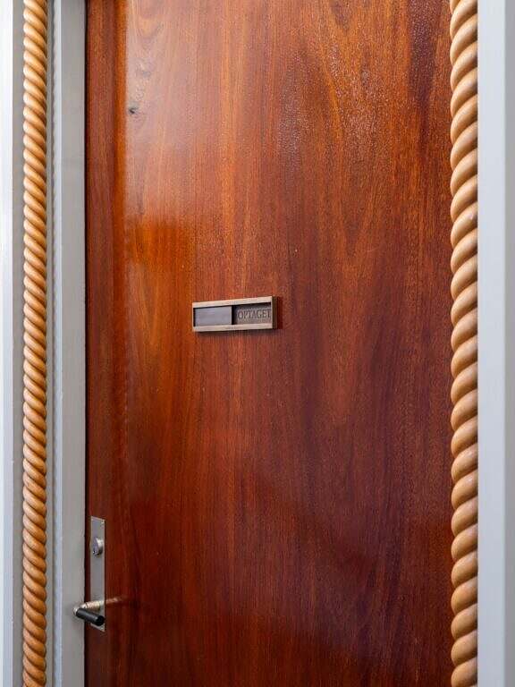
Copper signs
Selected functions are marked with signs made of copper, which adds a tactile and material weight. The warm glow of copper interacts with the building's classic details and patinates beautifully over time. The choice of material creates a sense of permanence and quality and emphasises the connection between historical architecture and contemporary use.