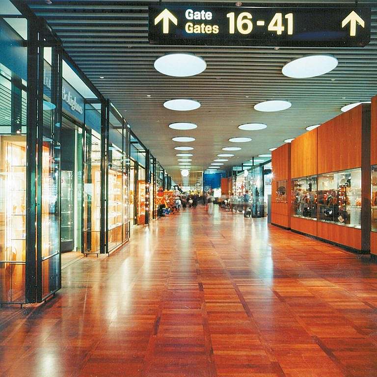
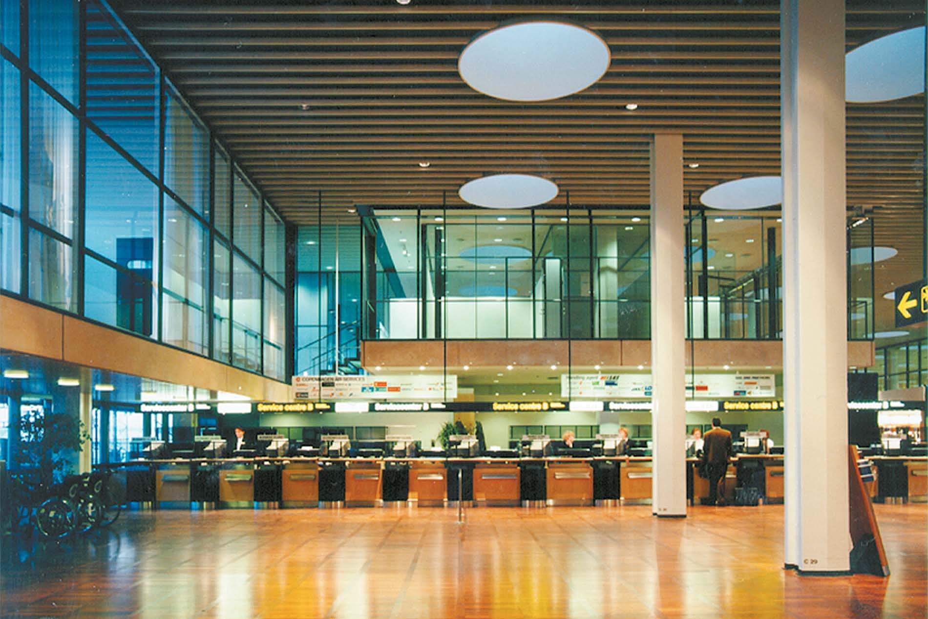
A thorough refurbishment of the airport's transit hall, with great respect for Vilhelm Lauritzen's original 1960 interior.
Kastrup
Denmark

Glass, steel and pearwood
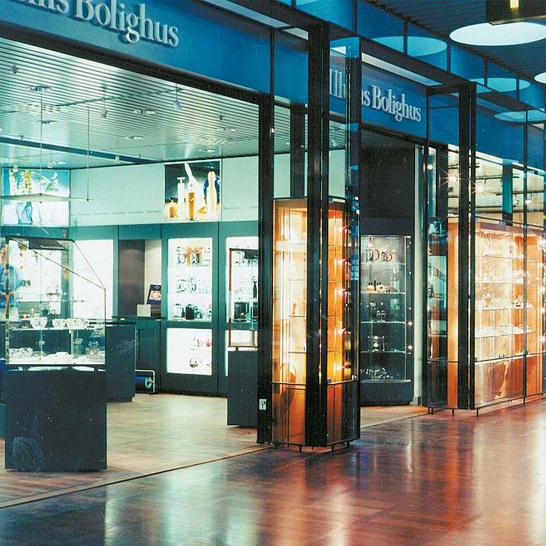
All existing shops were demolished and new ones built according to a modified layout plan. Between the retail areas and the shopping street, a zone with exhibition stands was laid out, forming the transition between the hall and the individual tenants. This maintains the overall façade idea, while allowing the changing tenants in their own areas to furnish themselves according to their own concept.
The materials are steel, glass and pear wood. All steel is lacquered in a black/grey colour, except for handrails on stairs which are ruby red. Metal ceilings and metal clad walls are painted aluminium grey. Glass ceilings, glass floors and glass steps are in matt laminated glass. The display cabinets are made of narrow steel profiles with glued glass sections and a body of oil-treated pearwood with hanging glass shelves. The glass walls on the second floor are also made of narrow steel profiles with glued glass sections.
A much needed face lift
Due to an increasing number of passengers at Copenhagen Airport, various traffic problems had arisen in the transit hall. The aisles were too narrow, the escape route conditions inadequate, the commercial areas poorly utilised and there was a lack of overall design and signage guidelines. At the same time, CPH wanted a general "face lift" throughout the hall.
On this basis, KHR developed a design and signage concept that resulted in an overall plan for a thorough refurbishment of the first and second floors of the transit hall. The basic wish was greater simplicity and a more austere expression - a return to Vilhelm Lauritzens original layout of the transit hall from 1960.

