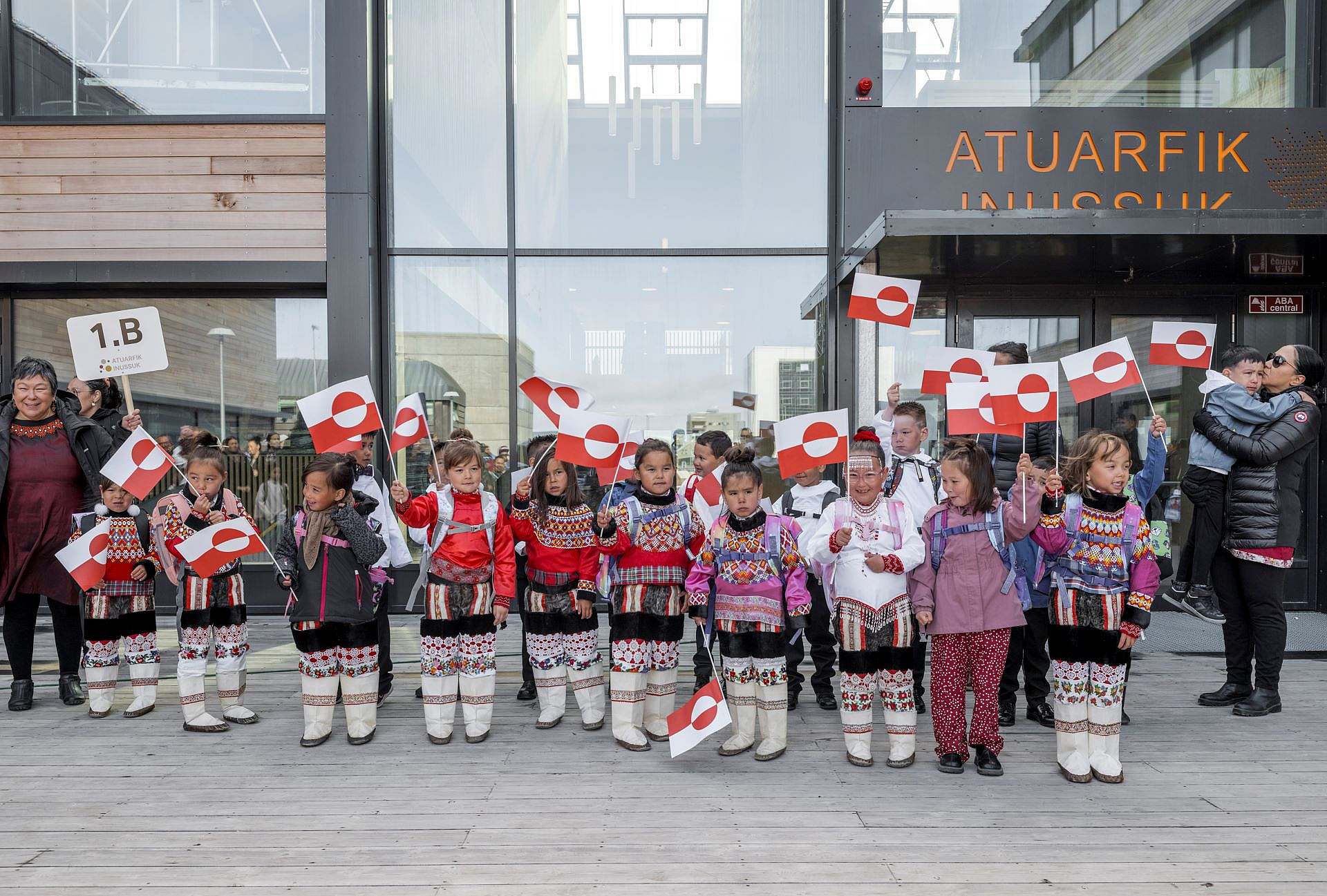
At Nuuk School, wayfinding is an integral part of the architecture and user experience. Students, teachers and visitors must be able to easily find their way around the many buildings and functions - not through heavy signage systems, but through a visual and sensory strategy based on Greenland's rich nature, colour codes and playful symbolism. The result is a recognisable and logical environment that supports learning and well-being.
Nuuk
Greenland
Kommuneqarfik Sermersooq
2024
17 500 ㎡
Wayfinding
Wayfinding at eye level with users
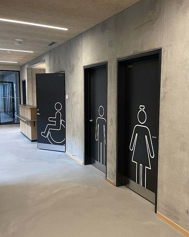
The wayfinding at Nuuk School is customised for children and young people and is designed as an integral part of the architecture - from flooring and furniture to graphic elements on doors, facades and glass sections. Each building has its own colour and a unique animal theme, which makes it easier to find your way around and creates an identity for the individual houses and classes. All information is placed at child height and designed so that it can be quickly decoded even without being able to read. The vibrant visual expression contributes to a safe and inspiring environment where orientation and aesthetics go hand in hand.
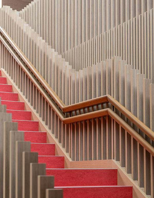
"The red lineoleum floor characterises all common areas, while providing a warm counterpoint to the raw concrete."
Customised solutions create consistency
All of them wayfinding-Elements at Nuuk school are customised to the site and go hand in hand with the architecture - if not actually part of it. The same goes for fixtures and fittings, whose colour scheme also contributes to wayfinding.
Every building its colour and its animal
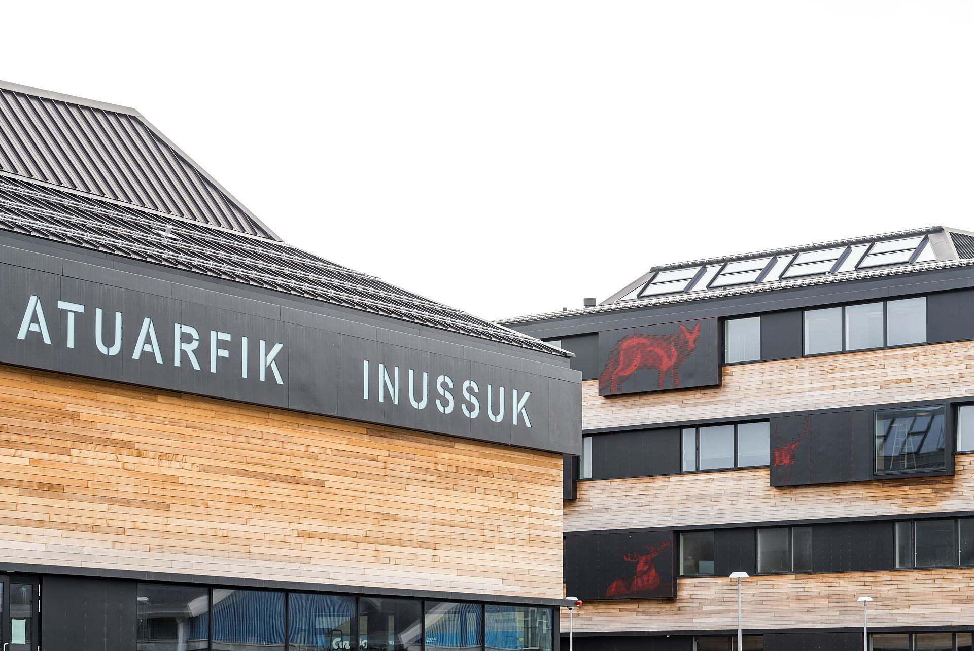
Each school building has its own visual identity, based on a specific animal group and a distinct colour. The animals are taken from Greenlandic fauna - such as the Arctic fox, bowhead whale and birds - and are staged in different sizes and positions on the facade panels.
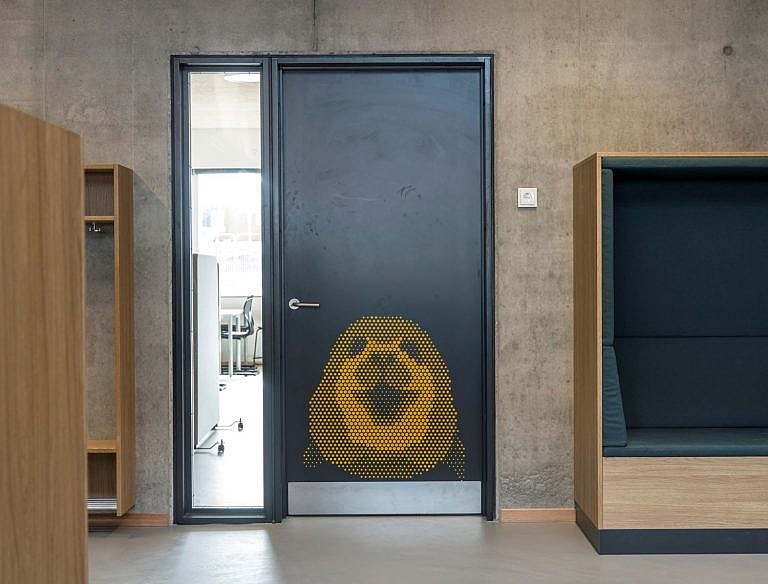
Each basic room has its own window niche with an animal motif that children can identify their class with from the outside. This motif is repeated on the door to the same room - in the same colour and shape as the facade. This creates a natural connection between inside and outside and supports intuitive wayfinding for students, even for those who cannot yet read.
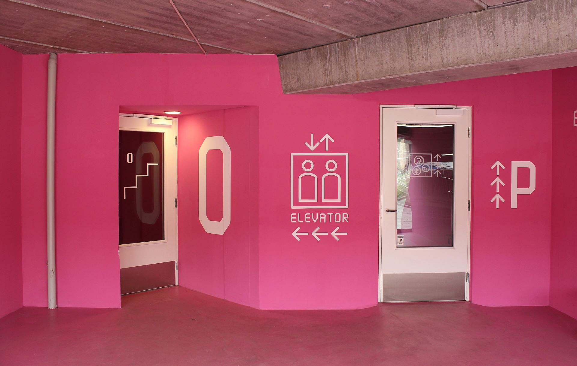
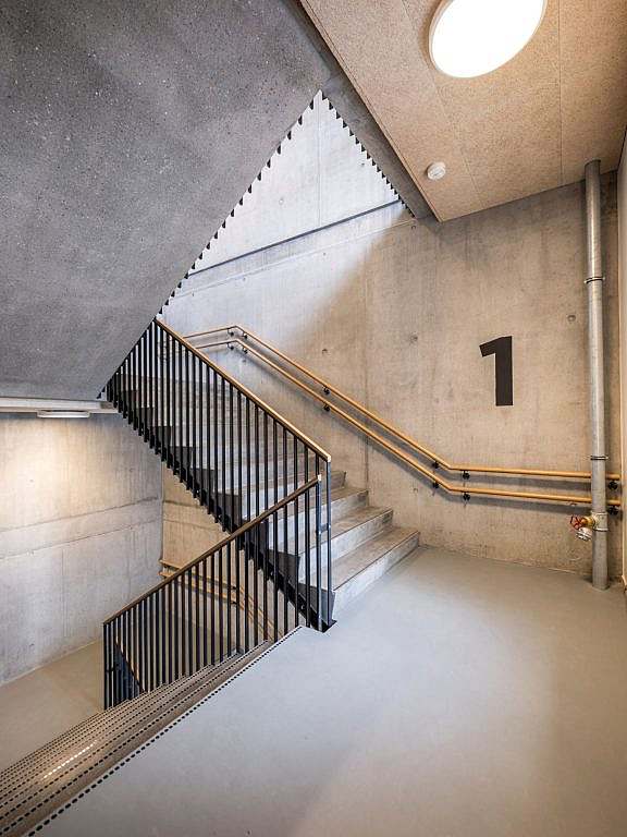
Megagraphics on raw concrete
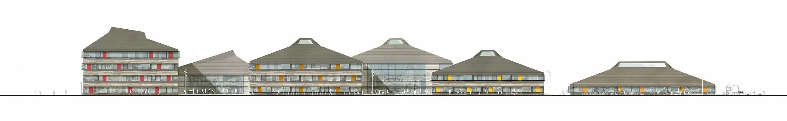
A large overview sign at the main entrance provides an overview of the school's functions and buildings. Inside, the floors are marked with mega-graphics in stairwells and signs by lifts. Here too, the graphics are painted directly onto the walls for a robust, simple and easy-to-maintain look. Colours and symbols are repeated and reinforce the vertical orientation of the building.
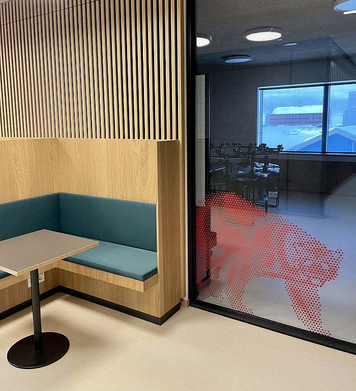
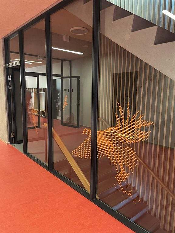
Print on glass - safety and orientation
The animal motifs are also continued on the inside of glass walls and doors, where they act as both wayfinding and safety markings. The coloured foil motifs clearly mark the transition between zones and buildings, while making the glass surfaces visible and therefore safer to use. The glass graphics are placed at a height that matches both function and field of vision.